Plotting functionalities
RAMP’s plotting class offers some functionalities for visualizing
outputs. A Plot class can be initialized by reading a
pandas.DataFrame or reading results from a .csv or .xlsx
file.
Initializing a Plot class
Running RAMP interactively
from ramp import User, UseCase
# creating a user and adding some appliances
Petrol_Station = User(
user_name="Petrol Station",
num_users=1,
)
# add appliances
outside_bulb = Petrol_Station.add_appliance(
name="Security Light",
number=2,
power=18, # watt
num_windows=2, # security light has two functioning window: during night and during day
fixed_cycle=0, # bulb has no duty cycle and always work with a single cycle
window_1=[0, 7 * 60], # from mid-night to 7 AM with opening
window_2=[21 * 60, 23 * 60 + 59], # from 21 to 23:59
fixed="yes",
flat="yes",
)
inside_bulb = Petrol_Station.add_appliance(
name="Indoor Light",
number=1,
power=75, # watt
num_windows=1, # security light has two functioning window: during night and during day
fixed_cycle=0, # bulb has no duty cycle and always work with a single cycle
window_1=[7 * 60, 21 * 60], # from mid-night to 7 AM,9PM with opening,
func_cycle=1, # when the appliance is switched on, it remains on at least for a min,
occasional_use=1, # it is always present in the energy mix
func_time=30, # usually is used around 60 min during the whole day
time_fraction_random_variability=0.9,
random_var_w=0.15,
)
petrol_pump = Petrol_Station.add_appliance(
name="Petrol Pump",
number=1,
power=200,
num_windows=1,
fixed_cycle=0,
window_1=[7 * 60, 21 * 60],
func_cycle=1,
occasional_use=1,
func_time=40,
time_fraction_random_variability=0.15,
random_var_w=0.15,
)
# phone chargers
phone_charger = Petrol_Station.add_appliance(
name="Phone Charger",
number=1,
power=5,
num_windows=1,
fixed_cycle=0,
window_1=[7 * 60, 21 * 60],
func_cycle=30,
occasional_use=0.7,
func_time=60,
time_fraction_random_variability=0.15,
random_var_w=0.15,
)
# Radio
radio = Petrol_Station.add_appliance(
name="Radio",
number=1,
power=5,
num_windows=1,
fixed_cycle=0,
window_1=[7 * 60, 21 * 60],
func_cycle=20,
occasional_use=0.95,
func_time=4 * 60,
time_fraction_random_variability=0.15,
random_var_w=0.15,
)
# running the simulation for multiple cases to generate mutlipe simulations for a year = 2022
number_of_simulations = 11
number_of_days = 365
uc = UseCase(users=[Petrol_Station], date_start="2022-01-01")
uc.initialize(num_days=number_of_days)
plot = uc.generate_daily_load_profiles(
cases=[profile for profile in range(1, number_of_simulations + 1)]
)
You will simulate 365 day(s) from 2022-01-01 00:00:00 until 2023-01-01 00:00:00
If the dataframe object did not have a pd.DatatimeIndex, the plot
class could not be initialized. in this case, you can use the index
argument to pass a datetime index!
Running via the CLI and reading back the outputs from .csv or .xlsx
If you run your RAMP simulations from a terminal, and save your outputs into a file, you can read your saved results to perform your analysis. The structure of the saved results should be exactly as shown in previous line where the index is a date-time index and on the columns you have different cases, or even different users of your simulation case. To read the file:
# Uncomment the line below once you have replaced the placeholder with the path of an existing file
# plot = Plot.from_file(file="path to .csv or .xlsx file")
If the data in the file did not have a date-time index, the plot class
could not be initialized! in this case, you can use the index
argument to pass a datetime index!
Filtering data using loc & iloc functions
If you need to use only a part of your data, you can use the loc
function. For example, to take only the second day of your data:
import pandas as pd
second_day = pd.date_range(
start="2022-01-01 00:00:00", freq="1min", periods=24 * 60 # a full day
)
filtered_data = plot.loc(index=second_day)
If you need to also filter on the columns, you can use the columns
argument or use the get item method:
# using the function
filtered_data = plot.loc(index=second_day, columns=["case 1", "case 2"])
filtered_data
case 1 case 2
2022-01-01 00:00:00 36.0 36.0
2022-01-01 00:01:00 36.0 36.0
2022-01-01 00:02:00 36.0 36.0
2022-01-01 00:03:00 36.0 36.0
2022-01-01 00:04:00 36.0 36.0
2022-01-01 00:05:00 36.0 36.0
2022-01-01 00:06:00 36.0 36.0
2022-01-01 00:07:00 36.0 36.0
2022-01-01 00:08:00 36.0 36.0
2022-01-01 00:09:00 36.0 36.0
......
# using the get item method
filtered_column = plot["case 1"]
filtered_column
case 1
2022-01-01 00:00:00 36.0
2022-01-01 00:01:00 36.0
2022-01-01 00:02:00 36.0
2022-01-01 00:03:00 36.0
2022-01-01 00:04:00 36.0
2022-01-01 00:05:00 36.0
2022-01-01 00:06:00 36.0
2022-01-01 00:07:00 36.0
2022-01-01 00:08:00 36.0
2022-01-01 00:09:00 36.0
......
To filter the data using the position of the data, you can use the
iloc function. For example, for filtering your data from the 6th row
to 10th row:
filtered_rows = plot.iloc(index=slice(6, 11))
filtered_rows
case 1 case 2 case 3 case 4 case 5 case 6 case 7 case 8 case 9 case 10 case 11
2022-01-01 00:06:00 36.0 36.0 36.0 36.0 36.0 36.0 36.0 36.0 36.0 36.0 36.0
2022-01-01 00:07:00 36.0 36.0 36.0 36.0 36.0 36.0 36.0 36.0 36.0 36.0 36.0
2022-01-01 00:08:00 36.0 36.0 36.0 36.0 36.0 36.0 36.0 36.0 36.0 36.0 36.0
2022-01-01 00:09:00 36.0 36.0 36.0 36.0 36.0 36.0 36.0 36.0 36.0 36.0 36.0
2022-01-01 00:10:00 36.0 36.0 36.0 36.0 36.0 36.0 36.0 36.0 36.0 36.0 36.0
......
Adding new columns to the data
In case you want to add new columns to your data, you can use the
add_column function:
# lets take a copy of the current plot object
copy_plot = plot.copy()
# lets take a column of the existing data
new_data = plot["case 1"]
# lets change the name of the column assuming that this is a new data
new_data.columns = ["new column"]
copy_plot.add_column(new_data)
copy_plot
case 1 case 2 case 3 case 4 case 5 case 6 case 7 case 8 case 9 case 10 case 11 new column
2022-01-01 00:00:00 36.0 36.0 36.0 36.0 36.0 36.0 36.0 36.0 36.0 36.0 36.0 36.0
2022-01-01 00:01:00 36.0 36.0 36.0 36.0 36.0 36.0 36.0 36.0 36.0 36.0 36.0 36.0
2022-01-01 00:02:00 36.0 36.0 36.0 36.0 36.0 36.0 36.0 36.0 36.0 36.0 36.0 36.0
2022-01-01 00:03:00 36.0 36.0 36.0 36.0 36.0 36.0 36.0 36.0 36.0 36.0 36.0 36.0
2022-01-01 00:04:00 36.0 36.0 36.0 36.0 36.0 36.0 36.0 36.0 36.0 36.0 36.0 36.0
2022-01-01 00:05:00 36.0 36.0 36.0 36.0 36.0 36.0 36.0 36.0 36.0 36.0 36.0 36.0
2022-01-01 00:06:00 36.0 36.0 36.0 36.0 36.0 36.0 36.0 36.0 36.0 36.0 36.0 36.0
2022-01-01 00:07:00 36.0 36.0 36.0 36.0 36.0 36.0 36.0 36.0 36.0 36.0 36.0 36.0
2022-01-01 00:08:00 36.0 36.0 36.0 36.0 36.0 36.0 36.0 36.0 36.0 36.0 36.0 36.0
2022-01-01 00:09:00 36.0 36.0 36.0 36.0 36.0 36.0 36.0 36.0 36.0 36.0 36.0 36.0
......
Resampling data
If you want to represent your data in a different time resolution, you need to resample the data. In this case, the original data (plot object) has a minute time resolution:
plot.freq
<Minute>
Let’s assume you want to resample your data to an hourly resolution. To
do so, you can use the resample function:
hourly_data = plot.resample(
freq="1h", # resampling freqency, similar pd.DataFrame rule
rule="sum", # different options for resampling data like sum, mean, nearest
conversion=60, # resampling data from minute resolution to hour resolution has an assumption of dividing the minute date by 60 minutes to sum to hourly data
)
Let’s check the resolution now:
hourly_data.freq
<Hour>
You can further apply all the Plot functions to the output of this
resampling. For example, if you want to calculate the weekly consumption
average based on the hourly data, you can use:
weekly = hourly_data.resample(freq="1w", rule="mean")
weekly.freq
<Week: weekday=6>
Compute Mean, Sum, and Peak
You can calculate the mean and the sum of all the columns of your RAMP
simulations stored in a Plot object using the mean and sum
functions:
mean = hourly_data.mean()
mean
Mean
2022-01-01 00:00:00 36.000000
2022-01-01 01:00:00 36.000000
2022-01-01 02:00:00 36.000000
2022-01-01 03:00:00 36.000000
2022-01-01 04:00:00 36.000009
2022-01-01 05:00:00 37.515430
2022-01-01 06:00:00 44.341832
2022-01-01 07:00:00 3.040070
2022-01-01 08:00:00 1.646964
2022-01-01 09:00:00 6.791291
......
summed = hourly_data.sum()
summed
Sum
2022-01-01 00:00:00 396.000000
2022-01-01 01:00:00 396.000000
2022-01-01 02:00:00 396.000000
2022-01-01 03:00:00 396.000000
2022-01-01 04:00:00 396.000100
2022-01-01 05:00:00 412.669733
2022-01-01 06:00:00 487.760150
2022-01-01 07:00:00 33.440767
2022-01-01 08:00:00 18.116600
2022-01-01 09:00:00 74.704200
......
You can also find the the peak values and correspondoing hours to the
peak value for each column of your data using the peak property:
peak = hourly_data.peak
peak
{'case 1': 2022-08-16 21:00:00 184.502267
Freq: H, Name: case 1, dtype: float64,
'case 2': 2022-04-23 12:00:00 170.418517
Freq: H, Name: case 2, dtype: float64,
'case 3': 2022-09-07 21:00:00 166.00135
Freq: H, Name: case 3, dtype: float64,
'case 4': 2022-03-26 22:00:00 153.8342
Freq: H, Name: case 4, dtype: float64,
'case 5': 2022-05-09 06:00:00 172.667167
Freq: H, Name: case 5, dtype: float64,
'case 6': 2022-06-29 06:00:00 166.000667
Freq: H, Name: case 6, dtype: float64,
'case 7': 2022-09-04 18:00:00 160.169433
Freq: H, Name: case 7, dtype: float64,
'case 8': 2022-03-17 06:00:00 162.666883
Freq: H, Name: case 8, dtype: float64,
'case 9': 2022-10-20 06:00:00 152.667083
Freq: H, Name: case 9, dtype: float64,
'case 10': 2022-10-02 21:00:00 156.0024
Freq: H, Name: case 10, dtype: float64,
'case 11': 2022-12-27 06:00:00 158.917483
Freq: H, Name: case 11, dtype: float64}
Visualisation
A Plot object offers some easy-to-use plotting functions for routine
visualisations. Each plotting function allows you to choose the plotting
engine, which can be either matplotlib or plotly. The output of
the plot functions will be a matplotlib or plotly object, so you
can customize your functions after plotting with your specific taste and
plotting style! You can also use the ** kwargs to pass plotly or
matplotlib specific styling features.
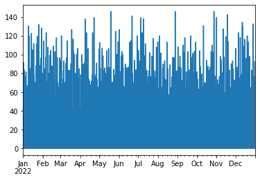
Line plot
With the line plot function, you can choose one or multiple columns of your data to plot a simple line plot:
# plotting one column using matplotlib engine (default engine)
hourly_data.line(columns="case 1")
<Axes: >
# plotting all columns using plotly engine, you can
hourly_data.line(engine="plotly", plot_bgcolor="gray", title="My Beautiful Plot")
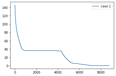
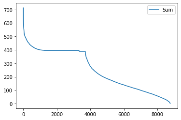
Load duration curve
A Load duration curve (LDC), also known as a duration curve or a
load-duration profile, represents the cumulative distribution of a given
energy demand over a specified period of time. To plot this curve, you
may use the load_duration_curve function in different modes, like
taking a specific column of your data and calculating the mean or sum.
To this end, go through the steps below.
# Taking a column
hourly_data.load_duration_curve(column="case 1")
<Axes: >
# plotting for mean
hourly_data.mean().load_duration_curve("Mean")
<Axes: >

# Taking sum
hourly_data.sum().load_duration_curve("Sum")
<Axes: >
Area Plot
Using the area plot function, you can plot the cumulative sum of the
the columns in your data.
hourly_data.area(engine="plotly")
Shadow Plot
In case you want to represent all the simulations together to show the variability of stochastic profiles generated by RAMP, you may use the shadow plot.
# to have a more visible visualisation, let's only take the first 5 days of the data using the iloc function
hourly_data.iloc(index=slice(0, 24 * 5)).shadow(
average=True, # plotting the average with a bold line and all the other columns as a cloud around it
engine="plotly",
)
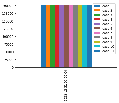
General plot function
The Plot object has a function called plot that returns a
pd.DataFrame.plot function offering some more plotting routines:
# plotting the yearly consumption of different cases as bar charts
hourly_data.resample("1y", "sum").plot(kind="bar")
<Axes: >
Saving the data into a file
If you want to save the data into a .csv or .xlsx file, you can
use the two save functions:
# saving as csv
hourly_data.to_csv("path and name of csv file.csv")
# saving as xslx
hourly_data.to_excel("path and name of excel file.xlsx")